When designing a kitchen or a bathroom, most homeowners focus on layout, materials, and functionality. But one of the most powerful and often overlooked elements in shaping how a space feels is color. The colors you choose for your walls, cabinets, tiles, or even appliances have a direct influence on the mood and energy of the room and by extension, your own.
Whether you’re going for calm and serene or bold and energizing, understanding how colors work psychologically can help you design a kitchen or bathroom that doesn’t just look beautiful but also feels right for how you want to use the space.
Color Psychology in Interior Design
Color psychology is the study of how different colors affect human behavior, mood, and perception. Each color evokes emotional and physiological responses. In interior design, these effects can be used to support the room’s function:
•Warm colors like red, orange, and yellow can energize and stimulate.
•Cool colors like blue, green, and gray can relax, calm, and refresh.
•Neutral tones like white, beige, and soft grays create balance and provide flexibility for changing moods or accents.
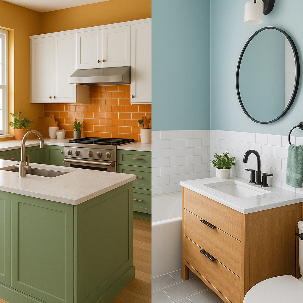
Kitchen Colors and Their Emotional Impact
The kitchen is often referred to as the heart of the home. It’s a place for cooking, gathering, and sometimes even working or studying. Because of its multifunctional nature, color choices in the kitchen should strike a balance between warmth and functionality.
– Red and Orange
These warm hues are known to stimulate appetite and conversation. They add vibrancy and a sense of excitement, making them popular choices for kitchen accent walls or backsplashes. However, too much red can feel overwhelming, especially in small spaces. Using it sparingly creates a more balanced result.
– Yellow
Yellow symbolizes happiness and energy. A pale yellow kitchen can feel sunny and welcoming, while brighter yellows might bring a sense of vitality. It’s especially good for kitchens that don’t get much natural light.
– White and Neutrals
A timeless choice, white gives a sense of cleanliness and openness. It reflects light well, making a space feel larger and brighter. It also allows for flexibility you can change out accent colors with accessories, towels, or small appliances.
– Green and Blue
While less traditional, green and blue kitchens have grown in popularity. Soft greens can feel fresh and organic, while deeper forest tones add sophistication. Blue kitchens, especially in navy or slate tones, can feel calm and orderly but they need to be paired with warm wood or metallic elements to avoid feeling cold.
Bathroom Colors and Mood Enhancement
Bathrooms are increasingly viewed as personal retreats spaces to unwind and recharge. Color plays a major role in creating that atmosphere.
– Blue and Aqua Tones
Perhaps the most popular bathroom colors, shades of blue evoke water and sky, instantly creating a spa-like, refreshing ambiance. Light blue relaxes the mind, while darker navy adds elegance and tranquility.
– Green
Green, particularly in muted sage or mossy tones, feels grounding and natural. It brings the outdoors in and can help lower stress levels.
– Neutrals and Whites
Clean, minimal, and sophisticated—white bathrooms feel hygienic and peaceful. When paired with natural textures like wood or stone, they offer a timeless, serene space.
– Warm Earth Tones
Beiges, terracotta, or taupe tones can make bathrooms feel cozy and comforting, especially when used with soft lighting. These hues give a sense of calm and can be particularly appealing in colder climates.
Tips for Choosing the Right Colors
– Consider Natural Light:
Rooms with plenty of sunlight can handle cooler or darker tones. Small or windowless bathrooms and kitchens may benefit from lighter, warmer hues to prevent feeling cramped or cold.
– Match Mood with Function:
Kitchens benefit from energizing tones that encourage activity and interaction, while bathrooms are best served by calming, peaceful palettes.
– Test Before Committing:
Always test color samples on your walls at different times of the day. Lighting dramatically affects how a color appears and feels.
– Use Accents Wisely:
If you’re hesitant about strong colors, use them in accents backsplashes, towels, cabinet hardware, or artwork. This adds personality without overwhelming the space.
Color is not just decoration, it’s a powerful tool that can transform how a room feels and functions. When designing a kitchen or bathroom, your color choices should reflect not just your aesthetic tastes but also your emotional needs. A well-thought-out color palette can create a space that energizes your mornings, soothes your evenings, and supports your lifestyle every day.
By applying the principles of color psychology, you can create environments that feel as good as they look. So next time you’re remodeling or redecorating, remember: the colors you choose are more than just paint they’re part of your everyday experience.
Have a question or want to discuss ideas for your home?Call us at (323) 212-3020 or request a complimentary consultation.